Dashboards
A system dashboard:
Cannot be deleted but you can enable or disable it to make it visible or not, on the Dashboards management page.
Cannot be renamed.
Can be duplicated.
System Dashboards
The application provides System Dashboards by default.
Click Dashboards in the menu to display the list:
Office 365 Operations
Exchange
OneDrive
Teams Advanced
Teams
SkypeForBusiness
MS Service Health
Mail Routing
Mail Routing Hybrid
Network
URL
Exchange Edge
ADFS
AAD Connect
Exchange Mailbox Servers
Exchange DAG
Robots Health
Custom Dashboards
Only Administrator users can create custom dashboards.
A custom dashboard can be edited using the Edition mode if you need to add, resize, move, remove a card, or rename the dashboard.
You can easily create a custom dashboard in the Dashboards management menu.
Dashboard overview
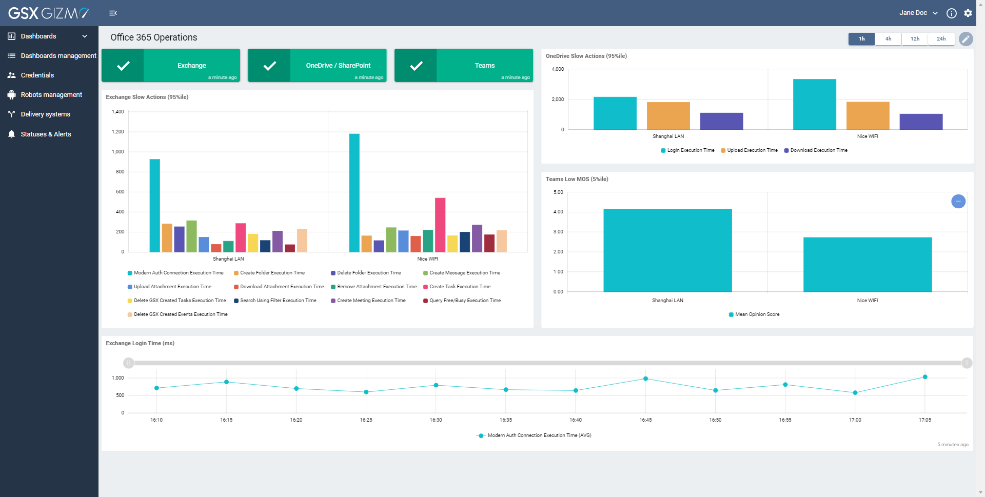
A dashboard consists of displaying data with cards.
Status cards
You can see here workloads are in different color status.
Color status is an indicator and can be the following:
GREEN indicator means that the status is OK: there is no issue detected.
ORANGE indicator means a degraded status.
RED indicator means a critical status.
Statuses are based on policies set by the application.
Click the info button to see more details.
This is the description of issues that need to be fixed.
Actions at the top-right allow you to:
Copy the message to clipboard.
Close this pop up message.
Graphs cards
The data is aggregated for up to 5 minutes for a best readability.
So if you scan all 3 minutes you will only see dots all the 5 minutes. And if you scan all 15 minutes, you will see dots all 15 minutes.
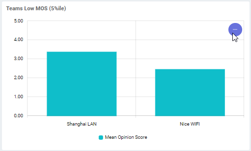
Click the +/- button to zoom in or zoom out on the graph (you can also select a specific area with the mouse to make a zoom).
When zooming on a graph, the selected area also applies on the other graph.
Click on an item of the graph legend to enable or disable the specific metric.
Then the selected metrics appear in grey.
Time period
Select a Time period if you need to display the data according to a specific period.
For example, click on 12h if you need to display the data during the last 12 hours.
Status card is always displaying its color according to real-time status, even when you click on a different Time period (during which an issue may have occurred).


